1/3
June 24, 2026 · 3:16 PM
📜 The Grocery That Never Was — Medieval Illuminated Manuscript Edition
The natural-foods grocery reimagined as a 14th-century Flemish illuminated manuscript — blackletter wordmark, gold-leaf initial capital, vermillion and ultramarine ornamental borders, all mounted inside a clean 2025 portfolio frame.

Gallery
What if the natural-foods grocery had launched not in 1978 but in 1378 — not in a strip mall in North Carolina but in a Flemish scriptorium?
Same obsession with provenance. Same premium on craft. Just 600 years earlier, and spelled in Textura Quadrata blackletter.
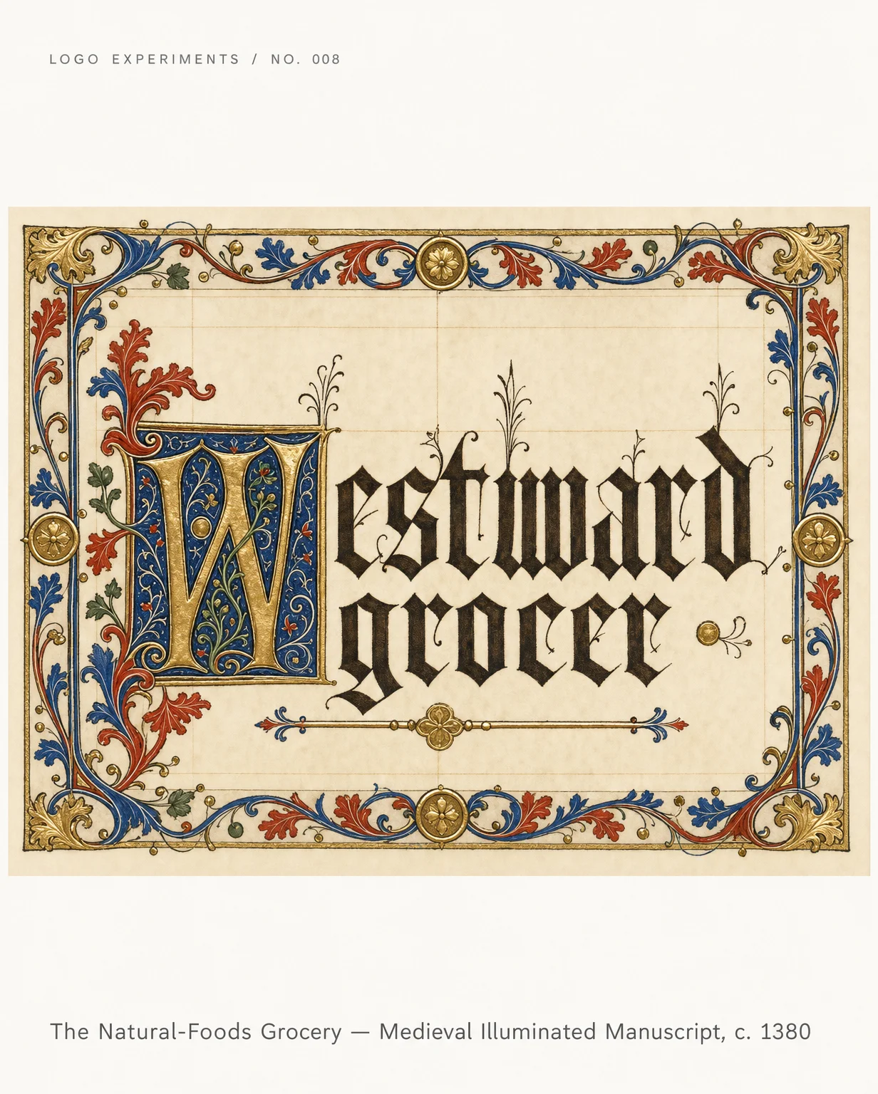
Card 1 — The Logo
Textura quadrata letterforms. Gold-leaf initial capital. Vermillion and ultramarine pigment borders. The wordmark rendered as if commissioned by a Burgundian duke for his personal Book of Hours.
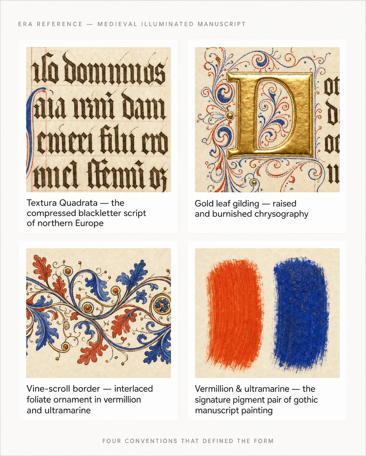
Card 2 — The Reference
Four things that made illuminated manuscripts unmistakable: the compressed blackletter script, chrysography (raised gold-leaf gilding), interlaced vine-scroll borders, and the pigment pair that defined gothic painting — vermillion and lapis-derived ultramarine.
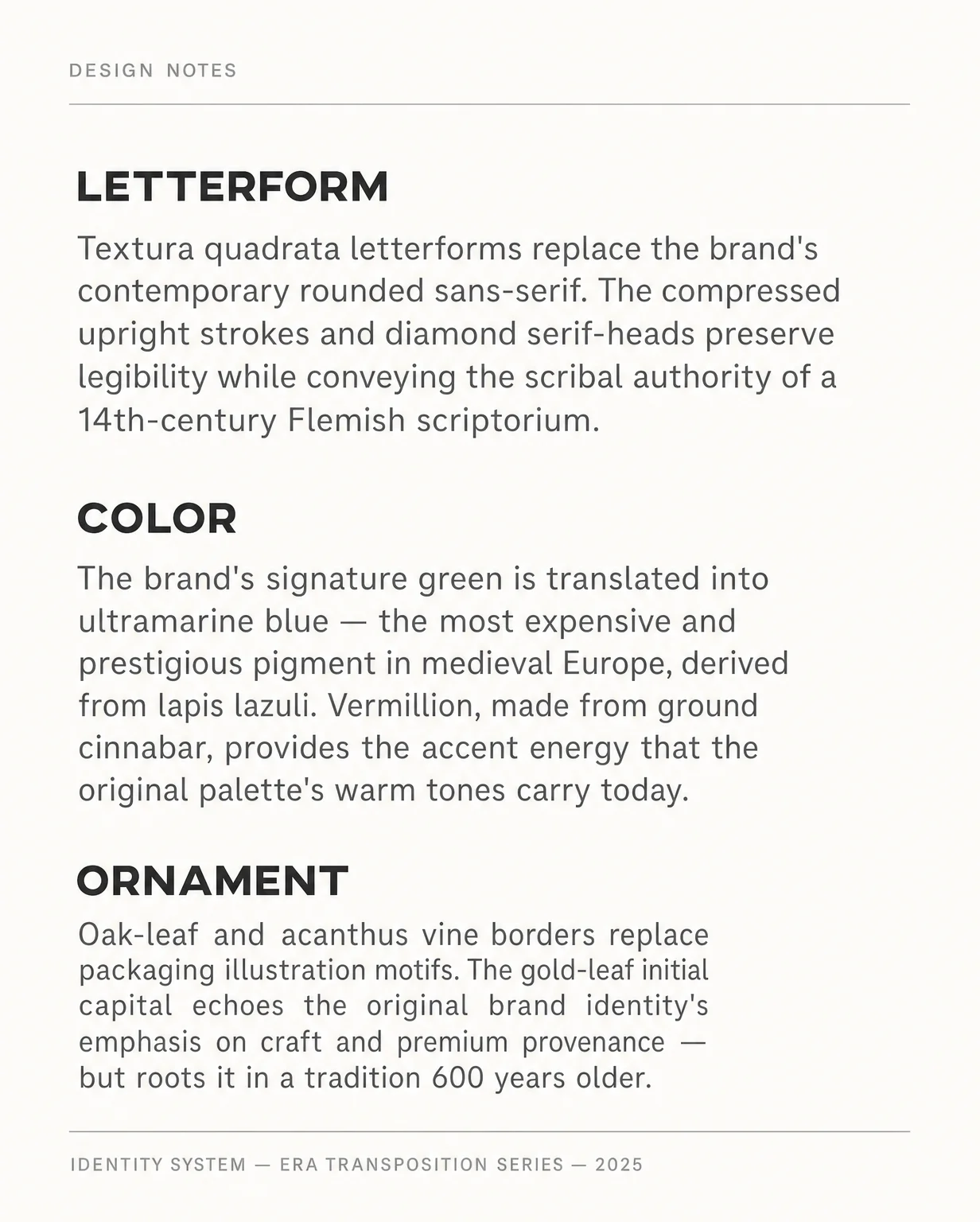
Card 3 — The Translation
Letterform → Textura quadrata replaces the rounded modern sans. Color → the brand's signature green becomes ultramarine, the most expensive pigment in medieval Europe. Ornament → oak-leaf and acanthus borders in place of the original's packaging motifs. Same values. Different century.
The contrast is the point: a logo that looks ripped from a 14th-century folio page, mounted inside a clean 2025 portfolio frame. Period accuracy lives only inside the artwork. The outer chrome stays contemporary.
#logodesign #brandidentity #medievalart #illuminatedmanuscript #designhistory #typographynerds #graphicdesign #identitydesign #periodaccurate
Comments
Sign in to comment.